Bookshelf Styling Visualizer
Practice the 60-30-10 rule by adjusting the ratios of books, decor, and negative space on your virtual shelf.
Ever walked into a room with a bookshelf that just felt... off? Maybe it looked cluttered, or perhaps it felt too sparse and cold. You aren't imagining it. Bookshelves are vertical storage units used to display books, decorative objects, and personal memorabilia while adding architectural interest to a room. They are not just storage; they are the backbone of a room's character. When styled poorly, they become visual noise. When styled well, they create rhythm, depth, and personality. The good news? You don't need an art degree to get this right. You just need to understand the basic rules of visual weight and balance.
The Golden Ratio: Why 60-30-10 Works Every Time
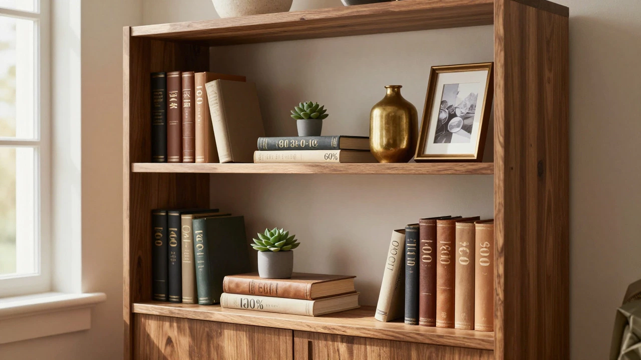
If you hang onto one rule, make it this one: the 60-30-10 ratio. This isn't magic; it's a proven principle in interior design that prevents your shelves from looking like a chaotic dump or a sterile museum display. Here is how you break it down:
- 60% Books: These are your anchors. They provide height, texture, and structure. Without enough books, the shelf lacks substance.
- 30% Decor: This includes plants, vases, framed photos, and small sculptures. These items add color and softness.
- 10% Negative Space: This is the empty air between items. It allows the eye to rest. If every inch is packed, the viewer feels overwhelmed.
Think of your bookshelf as a canvas. If you cover 100% of it with paint, there is no image. You need space to let the elements breathe. Start by placing your tallest books vertically to establish the baseline, then fill in with horizontal stacks and decor until you hit that sweet spot where the shelf looks full but not crowded.
Vertical vs. Horizontal: Creating Visual Rhythm
Placing all books vertically creates a rigid, uniform look that can feel boring. Placing them all horizontally makes the shelf look heavy and short. The secret to professional-looking styling is mixing orientations to create a zigzag pattern of heights.
Try this simple exercise: Place three tall books standing up on the left side. Next to them, stack two shorter books horizontally. Then, place one medium-height vase. Finally, add a few more vertical books on the right. Notice how your eye moves across the shelf? It travels up, down, across, and back again. This movement keeps the viewer engaged. If everything is the same height, the eye slides off the shelf immediately.
Use Bookends are decorative supports placed at the ends of rows of books to keep them upright and prevent tipping. Choose ones that complement your decor style rather than matching perfectly. A brass bookend against leather-bound spines adds warmth, while a ceramic one adds a pop of color.
Color Strategy: Grouping vs. Rainbow Arrangements
You have two main choices for arranging book colors: grouping by hue or keeping them random. Both work, but they serve different vibes.
Rainbow arrangement: Sorting books by color (red to orange to yellow) creates a striking, curated look. It’s bold and modern. However, it requires a large collection and can feel artificial if overdone. Use this sparingly-maybe on one specific shelf-to make a statement.
Randomized natural order: Keeping books in their original order or mixed randomly feels lived-in and cozy. To avoid looking messy, ensure the spine textures and sizes vary. Mix thick hardcovers with thin paperbacks. This variation breaks up blocks of color naturally without needing a strict sorting system.
If your books are mostly white or black spines, lean heavily on the decor items (the 30%) to introduce color. A bright green plant or a blue ceramic bowl will pop against neutral backgrounds.
The Rule of Three: Odd Numbers Look Better
In design, odd numbers are easier for the human brain to process. Groups of two look like pairs waiting for a partner. Groups of three create a triangle, which is visually stable and interesting.
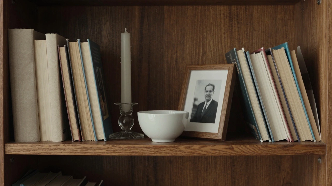
When styling a single shelf, try grouping items in threes. For example:
- A tall candle holder
- A small potted succulent
- A framed photograph leaning against the back wall
Vary the heights within these groups. If all three items are the same height, it looks like a row of soldiers. If they vary, it looks like a composition. You can also use the "triangle method": place the tallest item in the center or offset to one side, with smaller items flanking it. This creates a pyramid shape that draws the eye upward.
Adding Texture and Depth with Layering
Flat shelves can look flat if everything sits directly on the surface. Add depth by layering items. Lean a framed picture against the back wall instead of hanging it. Place a tray under a group of small objects to contain them and create a defined zone. Stack books horizontally, then place a small object on top of the stack.
Texture is crucial because it catches light differently. Smooth glass reflects light, matte ceramics absorb it, and rough wood diffuses it. Mix materials. Don’t put only wooden boxes on wooden shelves. Introduce metal, glass, fabric, or stone. This contrast prevents the shelf from looking monotonous, even if the color palette is neutral.
Consider using Shelf Liners are protective sheets or papers placed on shelf surfaces to add pattern, protect wood, and define spaces. A subtle geometric liner can tie disparate objects together, making a eclectic mix look intentional.
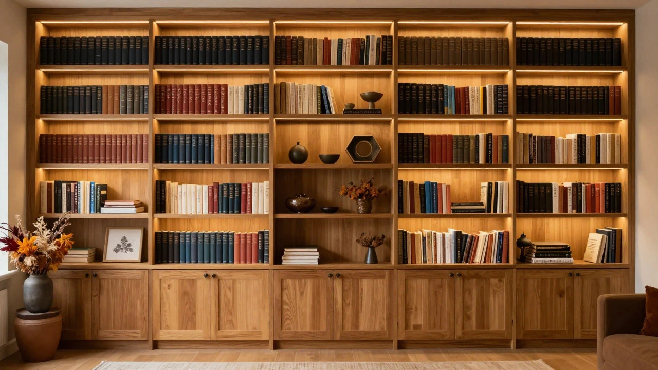
Negative Space: The Power of Empty Room
We often fear empty space, so we fill it. But negative space is a design tool. It highlights what is actually there. If you crowd every corner, nothing stands out. Leave some gaps. Let the shelf show through. This is especially important on taller shelves where the eye needs to travel up and down. Break up long vertical runs of books with a completely empty shelf or one with just a single, striking object.
This also helps with maintenance. Less stuff means less dusting. And realistically, life happens. You need room to slide a new book in without rearranging the entire library.
| Element | Goal | Common Mistake |
|---|---|---|
| Books | Provide structure and height | Stacking all horizontally (looks heavy) |
| Decor Items | Add color and personality | Using too many small trinkets (clutter) |
| Negative Space | Allow visual breathing room | Filling every gap (overwhelming) |
| Lighting | Highlight key pieces | Leaving shelves dark (dull appearance) |
Lighting: Illuminating Your Collection
Even the best-styled shelf looks flat in poor light. If your bookshelf is against a wall, consider adding LED strip lights inside the shelves or a small spotlight above. Lighting creates shadows, which add depth and drama. It turns a functional piece of furniture into a focal point. Warm light (2700K-3000K) enhances wood tones and creates a cozy atmosphere, perfect for living rooms.
Maintaining Balance Across Multiple Shelves
When styling a full bookcase, don't treat each shelf in isolation. Look at the unit as a whole. Distribute visual weight evenly. If the top shelf has heavy, dark books, balance it with lighter, brighter decor on the bottom. Avoid putting all your tall items on one side of the case. Move around the room and view the shelf from different angles. What looks balanced head-on might look lopsided from the side.
Rotate seasonal decor. Swap out summer-colored items for autumn tones. This keeps your home feeling fresh without buying new furniture. It’s a low-cost way to refresh your space regularly.
How do I stop my bookshelf from looking cluttered?
Clutter usually comes from too many small items and not enough negative space. Apply the 60-30-10 rule strictly. Remove any item that doesn't serve a purpose or bring you joy. Group small items together on trays or plates to contain them visually. Ensure you have empty space between groups of objects to let the eye rest.
Should I match my books by color?
You don't have to. Matching by color creates a very polished, modern look but can feel rigid. Mixing colors randomly feels more organic and cozy. If you choose to color-code, do it subtly-group similar tones together rather than creating a strict rainbow. Alternatively, focus on varying spine textures and sizes to add visual interest without strict color sorting.
What is the best height for items on a bookshelf?
There is no single best height, but variety is key. Aim for a mix of tall, medium, and short items. Avoid having all items at the same height, which creates a flat, boring line. Use the "triangle method" by placing taller items centrally or offset, with shorter items flanking them. This creates dynamic shapes that draw the eye across the shelf.
How many books should be on each shelf?
Aim for about 60% of the shelf volume to be occupied by books. This provides structure without overcrowding. Leave room for decor and negative space. If a shelf feels too empty, add horizontal stacks of books to build height. If it feels too full, remove some books and replace them with larger decor items or simply leave space.
Can I mix open and closed shelving?
Yes, mixing open and closed shelving is highly recommended. Open shelves display your collection and add airiness, while closed cabinets hide clutter and bulkier items. This combination balances visual interest with practicality. Use closed sections for less attractive items and open sections for your most beautiful books and decor.