Bookshelf Clutter Calculator
Visual Representation of Density
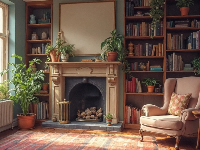
Most of us treat our bookshelves like storage units for things we haven't thrown away yet. You know the look: a chaotic mix of textbooks you never read, plastic bins, mismatched frames, and knick-knacks that just... appeared. It’s stressful to look at. But a well-styled bookshelf doesn’t have to be perfect or sterile. In fact, it shouldn't be. The goal isn't to create a museum display; it's to create a visual rhythm that lets your eye rest while showcasing what actually matters to you.
The secret to avoiding clutter isn't buying expensive organizers. It's about editing. If you want your shelves to look curated rather than chaotic, you need to stop treating every inch of space as valuable real estate. You need negative space. You need rules. And you definitely need to hide the ugly stuff.
The Golden Rule: Edit Before You Style
Before you place a single vase or frame, you have to clear the deck. This is the hardest part because it requires making decisions. Decluttering is the process of removing unnecessary items to create space and reduce visual noise. If you try to style around clutter, you'll just end up with organized mess.
Pull everything off the shelves. Yes, all of it. Dust the shelves while you're at it. Now, sort your books into three piles:
- Keep: Books you love, reference often, or that look beautiful (great spines, interesting colors).
- Store Elsewhere: Textbooks, old manuals, or duplicates you don't want on display but aren't ready to toss.
- Discard/Donate: Damaged copies, books you've already read and won't revisit, or titles that bore you.
Be ruthless. A common mistake is trying to fit every book onto the shelf. If you have more books than shelf space, use opaque storage boxes for the overflow. Only display the books that spark joy or add color. This immediately reduces density and creates breathing room.
Create Visual Rhythm with Groupings
Once you’ve edited your collection, how you arrange the remaining items determines whether the shelf looks intentional or accidental. Random placement is the enemy of good design. Instead, aim for visual rhythm.
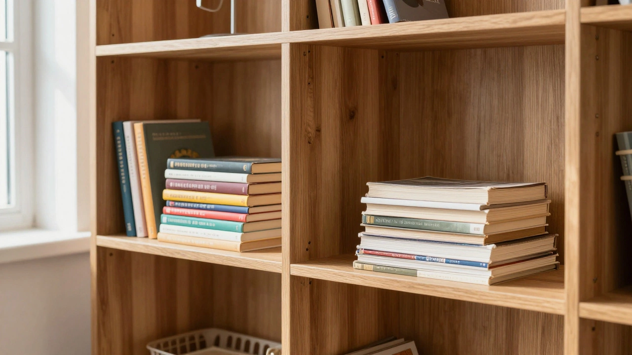
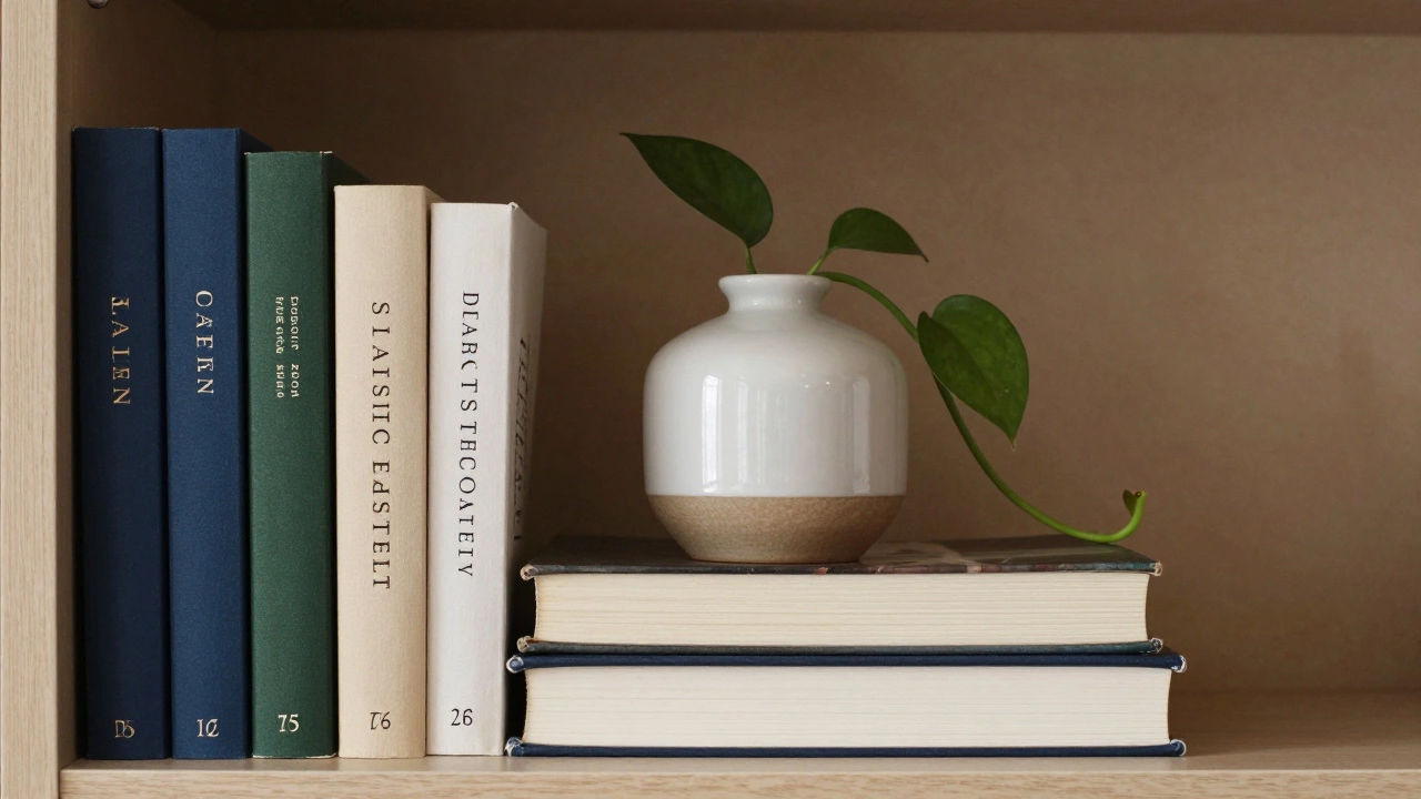
Group books by height, color, or subject. Standing them up vertically is standard, but mixing in horizontal stacks adds dimension. Here’s a simple formula that works almost every time:
- Vertical Block: Place 4-6 books standing upright together.
- Horizontal Stack: Stack 3-5 books horizontally next to them.
- Object Placement: Place a decorative object on top of the horizontal stack or next to the vertical block.
- Negative Space: Leave empty space after this grouping before starting the next one.
This "grouping" technique prevents the "one book here, one candle there" scatter effect. By creating distinct clusters, you guide the viewer’s eye across the shelf in a satisfying pattern. Try to keep the groups varied-some tall, some short-to avoid a monotonous wall of uniformity.
The Power of Negative Space
If there is one thing that separates amateur styling from professional design, it’s the use of negative space. Negative Space is the empty area around and between subjects in a composition. In interior design, empty shelf space isn't wasted space; it's a tool.
Filling every gap forces the eye to work too hard. It creates visual tension. When you leave gaps, you give importance to the objects you *do* display. Aim to fill only 70-80% of each shelf. If a shelf feels "empty," resist the urge to cram more stuff into it. Sometimes, less really is more. A single framed photo or a small plant on an otherwise bare shelf can look stunning, whereas the same items lost in a crowd of books look insignificant.
Mix Vertical and Horizontal Orientations
Variety in orientation breaks up the monotony of straight lines. While vertical books provide structure, horizontal stacks add depth and layers. However, don't overdo horizontal stacks. Too many flat piles can make the shelf look heavy and low.
A good rule of thumb is the "Two-and-a-Half" rule: For every two vertical groupings, include one horizontal stack. Also, vary the height of your horizontal stacks. Don't just stack three thick novels; try stacking two thin paperbacks and one thick coffee table book. This irregularity feels more natural and interesting.
Use these horizontal stacks as platforms. They are perfect spots for small sculptures, candles, or picture frames. Just ensure the object sitting on top is stable and proportional to the stack beneath it.
Incorporate Decorative Objects Strategically
Books are great, but they’re not enough. To make your bookshelf feel personal and layered, introduce non-book elements. However, this is where most people go wrong by adding too many unrelated trinkets.
Stick to a limited palette of decorative categories:
- Artwork: Small framed photos, prints, or even postcards leaned against the back of the shelf.
- Greenery: Potted plants, trailing vines, or dried flowers add life and softness.
- Sculptural Pieces: Vases, ceramics, or figurines that have a distinct shape.
- Functional Items: Candle holders, trays, or small lamps if you have wiring access.
Limit yourself to one or two types per shelf. Don't put a plant, a candle, a photo frame, and a ceramic bowl on the same shelf. Pick one hero object for each section. Rotate these objects seasonally to keep the look fresh without buying new decor.
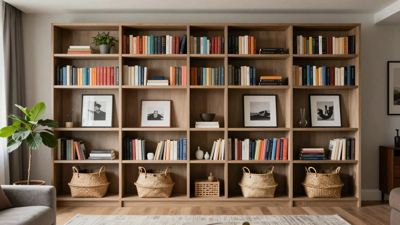
Hide the Ugly Stuff with Baskets and Boxes
Let’s be honest: some things belong on a shelf but don’t look good displayed openly. Think remote controls, charging cables, office supplies, or magazines. Leaving these out creates instant visual clutter.
Storage Containers are baskets, boxes, or bins used to conceal miscellaneous items while maintaining aesthetic appeal. Use woven baskets, wooden crates, or stylish fabric boxes to corral these items. Choose containers that complement your room’s color scheme-neutral tones usually work best so they blend into the background.
Place these containers strategically. A basket on the bottom shelf hides bulkier items, while a sleek box on a middle shelf can hold magazines neatly. The key is consistency. If you use woven baskets, stick to that material throughout the unit. Mixing wicker, plastic, metal, and wood can look disjointed unless you’re going for a very specific eclectic vibe.
| Do | Don't |
|---|---|
| Edit ruthlessly before styling | Try to fit every book you own |
| Leave 20-30% empty space | Cram items edge-to-edge |
| Group books by color or height | Randomly intersperse genres and sizes |
| Use opaque boxes for clutter | Display messy cables or remotes |
| Rotate decor seasonally | Buy new decor for every trend |
Play with Color and Texture
Color is a powerful organizing tool. Arranging books by spine color can create a striking rainbow effect or a sophisticated monochromatic look. If you don’t have enough colorful books, consider using slipcases or wrapping plain-spined books in colored paper for a temporary fix.
Texture adds warmth. Mix smooth leather-bound classics with matte paperback covers. Add a rough-hewn wooden sculpture next to a glossy magazine. Contrast keeps the eye engaged. If your books are mostly dark and serious, lighten the mood with white vases or bright artwork. If your books are light and airy, ground them with dark ceramics or metal accents.
Maintain Balance Across the Entire Unit
When stepping back to view the entire bookcase, check for balance. Does one side feel heavier than the other? Is the top crowded while the bottom is sparse?
Visual weight matters. Darker colors and larger objects feel heavier. Distribute these heavier elements evenly. If you have a large potted plant on the left shelf, balance it with a stack of large art books or a dark box on the right. Avoid putting all your heaviest items on the same side or level.
Also, consider the flow from top to bottom. Generally, heavier, darker items should be lower down, with lighter, airier items higher up. This grounds the piece and makes it feel stable. Don’t put fragile glassware on the very top shelf unless you’re sure no one will bump it.
How do I style a bookshelf with few books?
If you have fewer books, lean into the "display cabinet" approach. Use larger decorative objects like vases, sculptures, and framed art. Fill the gaps with stacked boxes or baskets. Treat the shelves as surfaces for decor rather than storage for literature. Focus on symmetry and negative space to make the sparse collection look intentional.
Should I arrange books by color or author?
For aesthetics, color is often more pleasing. It creates visual harmony and makes the shelf look curated. For functionality, author or genre is better. Many people compromise by grouping by genre and then arranging those groups by color within the group. This balances beauty with findability.
What is the best way to hide clutter on open shelves?
Use opaque storage containers like woven baskets, wooden boxes, or fabric bins. These hide messy items like cables, remotes, or office supplies while adding texture to the shelf. Avoid clear plastic bins unless they are perfectly organized, as they can still contribute to visual chaos.