Furniture Color Compatibility Analyzer
Have you ever stood in a showroom, staring at a sofa that looks perfect in the catalog but feels like it might clash with your rug, your walls, or even the light coming through your window? It is a common dilemma. We want our homes to feel cohesive, yet we are terrified of making a mistake that locks us into a specific style for the next decade. If you have been browsing a this resource for inspiration on how different environments can be styled with precision and discretion, you know that context matters just as much in home design as it does anywhere else. But when it comes to furniture, there is one answer that stands above the rest: neutral tones.
The Power of True Neutrals
When designers talk about colors that go with everything, they are not talking about beige alone. They are referring to a spectrum of muted, understated shades that act as a canvas rather than the main event. These colors do not demand attention; instead, they support the other elements in your room. Think of them as the background track in a song-they keep the rhythm steady without overpowering the vocals.
The most reliable neutral is Greige, which is a sophisticated blend of gray and beige that offers warmth without being too yellow and coolness without being too stark. Unlike pure white, which can feel sterile, or dark charcoal, which can make small rooms feel cave-like, greige strikes a balance. It works beautifully in both modern minimalist apartments and traditional family homes. If you buy a greige sectional sofa, you can change your throw pillows from navy blue to terracotta to sage green, and the room will always look intentional.
Why Gray Remains a Staple
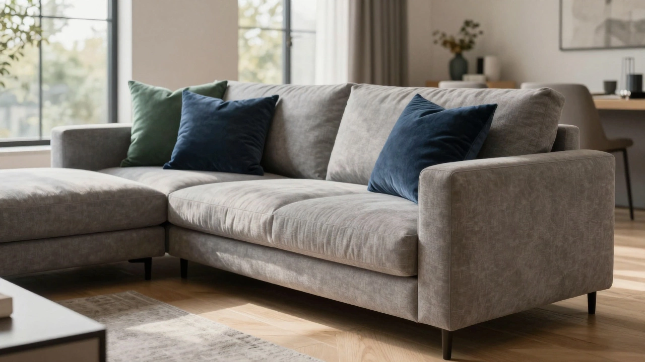
Gray has been the dominant neutral for the past fifteen years, and for good reason. It is incredibly versatile. A medium-toned gray armchair pairs effortlessly with wood tones, metal accents, and almost any fabric texture. However, the key is choosing the right undertone. Cool grays with blue hints work well in north-facing rooms where natural light is limited, helping to brighten the space. Warm grays with brown or taupe undertones add coziness to south-facing rooms that already receive plenty of sunlight.
If you are looking for furniture that goes with everything, a gray linen sofa is a safe bet. Linen adds texture, which prevents the neutral color from looking flat. You can layer velvet cushions, wool throws, and leather ottomans on top, creating visual interest without worrying about color clashing. The gray acts as a unifying element, tying disparate textures together into a harmonious whole.
The Case for Natural Wood Tones
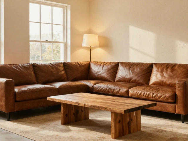
While fabric colors get all the attention, wood tones are equally important in determining whether furniture blends seamlessly. Light woods like oak, ash, and birch are incredibly adaptable. They bring a sense of airiness and freshness to a room, making them ideal for Scandinavian-inspired interiors or spaces that need to feel larger than they are. A light oak coffee table sits comfortably under a dark velvet sofa or a crisp white dining set.
Darker woods like walnut and mahogany offer a different kind of versatility. They provide grounding and sophistication. A walnut dining table can anchor a room with bold wallpaper or stand out elegantly against plain white walls. The trick with wood is consistency. If you choose light wood for your floor, sticking to similar tones for your furniture legs and frames creates a streamlined look. Mixing too many wood tones can create visual chaos, so pick one primary wood tone and stick to it for major pieces.
White and Off-White: The Clean Slate
White furniture is often feared because of its reputation for showing dirt. However, high-quality white upholstery in durable fabrics like microfiber or performance velvet can be both practical and stunning. White reflects light, making rooms feel brighter and more open. It also allows you to experiment with bold accent colors elsewhere in the room. A white dining chair set looks incredible against a deep emerald green wall or a rustic brick backdrop.
Off-white or cream tones are even more forgiving than pure white. They soften the harshness of bright whites while maintaining that clean, airy feel. Cream-colored rugs, for instance, hide everyday dust better than white ones and pair well with both warm and cool color palettes. When selecting white furniture, pay attention to the undertones. Yellow-based creams work well in kitchens and dining areas, promoting appetite and warmth. Blue-based whites are better suited for bathrooms and bedrooms, evoking calm and cleanliness.
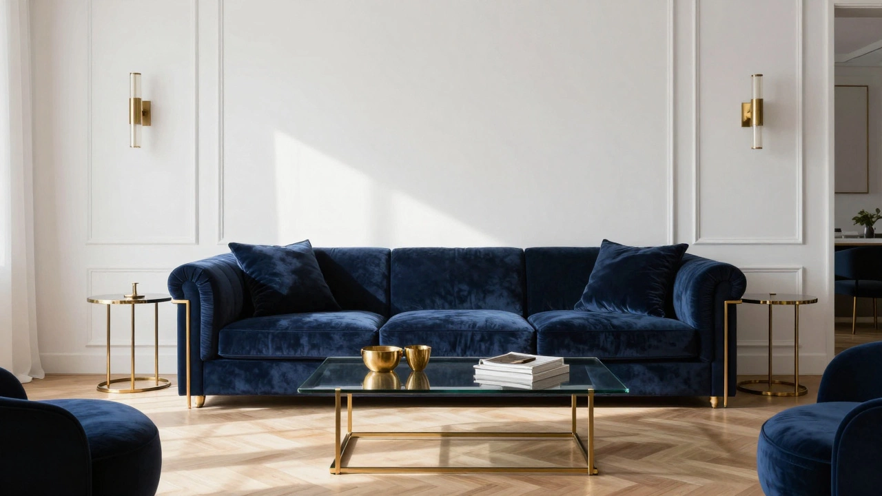
Navy Blue: The Dark Neutral
Many people consider navy blue a color, but in interior design, it functions as a neutral. It is rich, sophisticated, and pairs well with almost every other hue. A navy blue velvet sofa adds depth and drama to a living room without overwhelming it. It complements gold accents, brass hardware, and light wood floors beautifully. Navy also hides stains better than lighter neutrals, making it a practical choice for households with children or pets.
Unlike black, which can sometimes feel too severe or formal, navy blue retains a sense of approachability. It works in coastal-themed rooms with white and sandy accents, as well as in urban lofts with industrial elements. If you want a statement piece that still coordinates with everything else, navy blue is an excellent alternative to traditional grays and beiges.
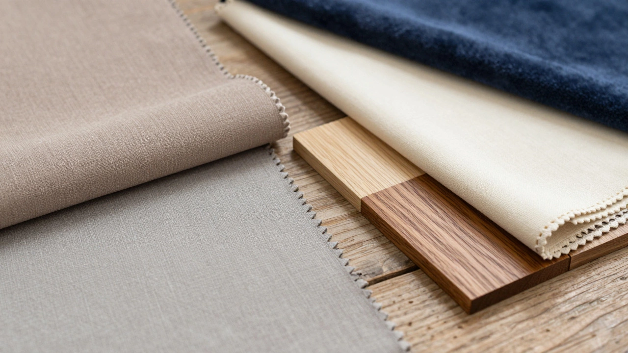
How to Test Colors Before Buying
Before committing to a large furniture purchase, test the color in your actual space. Lighting changes throughout the day, and what looks perfect under showroom lights might appear dull or washed out in your home. Take paint swatches or fabric samples home and place them against your existing walls and flooring. Observe how they look in the morning, afternoon, and evening.
Consider the surrounding elements. Does the new color complement your curtains, artwork, and accessories? If you are unsure, start with smaller pieces like accent chairs or side tables. This allows you to introduce a new color into the room without a significant financial risk. Online retailers often offer free fabric samples, which is a great way to see the true color and texture before buying.
| Color | Best For | Undertone Tip | Maintenance Level |
|---|---|---|---|
| Greige | Living Rooms | Warm/Cool Balance | Medium |
| Gray | Modern Spaces | Match Room Light | Low |
| Light Wood | Small Rooms | Consistent Tone | Low |
| Off-White | Bright Areas | Yellow vs Blue Base | High |
| Navy Blue | Statement Pieces | Pairs with Gold | Low |
Avoiding Common Pitfalls
One common mistake is assuming that "neutral" means boring. A room filled only with beige and gray can feel lifeless if there is no variation in texture or pattern. Add interest by mixing materials-combine smooth leather with rough jute, or soft velvet with hard wood. Patterns like stripes, checks, or subtle geometrics in neutral colors can add depth without introducing competing hues.
Another pitfall is ignoring the scale of the room. Large, dark furniture can overwhelm a small space, while tiny, light furniture can get lost in a large room. Ensure the size of your furniture matches the proportions of your space. Use mirrors and lighting to enhance the effect of neutral colors, reflecting light around the room to create a sense of openness.
Is beige still considered a trendy furniture color?
Yes, but it has evolved. Pure beige can feel dated, but greige (gray-beige) and warm taupe tones are very popular. They offer the comfort of beige with the modern edge of gray, making them highly versatile for contemporary interiors.
Can I mix different neutral colors in one room?
Absolutely. Mixing neutrals like gray, cream, and light wood creates a layered, sophisticated look. The key is to ensure the undertones are compatible. For example, avoid mixing a blue-based gray with a yellow-based cream unless you intentionally want a contrasting effect.
What is the best neutral color for a rental property?
Light gray or off-white is ideal for rentals. These colors appeal to a wide range of tenants and potential buyers, making the space feel clean and move-in ready. They also help hide minor wear and tear better than darker colors.
How do I prevent neutral furniture from looking boring?
Focus on texture and accessories. Use plush rugs, metallic lamp bases, and colorful throw pillows to add personality. Artwork and plants also bring life to neutral spaces, providing pops of color and organic shapes that contrast with structured furniture lines.
Does lighting affect how neutral furniture looks?
Yes, significantly. North-facing rooms benefit from warm neutrals like greige to counteract cool light. South-facing rooms can handle cooler grays. Always view furniture samples in your home's natural light at different times of day to see the true color impact.