Shelf Styling Simulator
Adjust the controls to start styling.
Most people treat bookcases as storage units. You stack books, close the door (if it has one), and forget about them until you need to find that specific recipe or novel. But a bookcase is actually one of the most versatile pieces of furniture in your home. It’s a vertical canvas. When styled correctly, it stops being just a place to hide clutter and becomes a focal point that tells a story about who you are.
If your shelves look flat, boring, or chaotic, it’s usually because you’re missing three things: depth, rhythm, and negative space. You don’t need to buy expensive art or rare artifacts to fix this. You just need to change how you arrange what you already own. Here is how to turn a standard shelf into something visually arresting.
The Power of Negative Space
The biggest mistake people make with bookcases is filling every inch of available surface area. We feel compelled to cover every gap. This creates visual noise. Your eye has nowhere to rest, so the whole unit feels heavy and cluttered instead of curated.
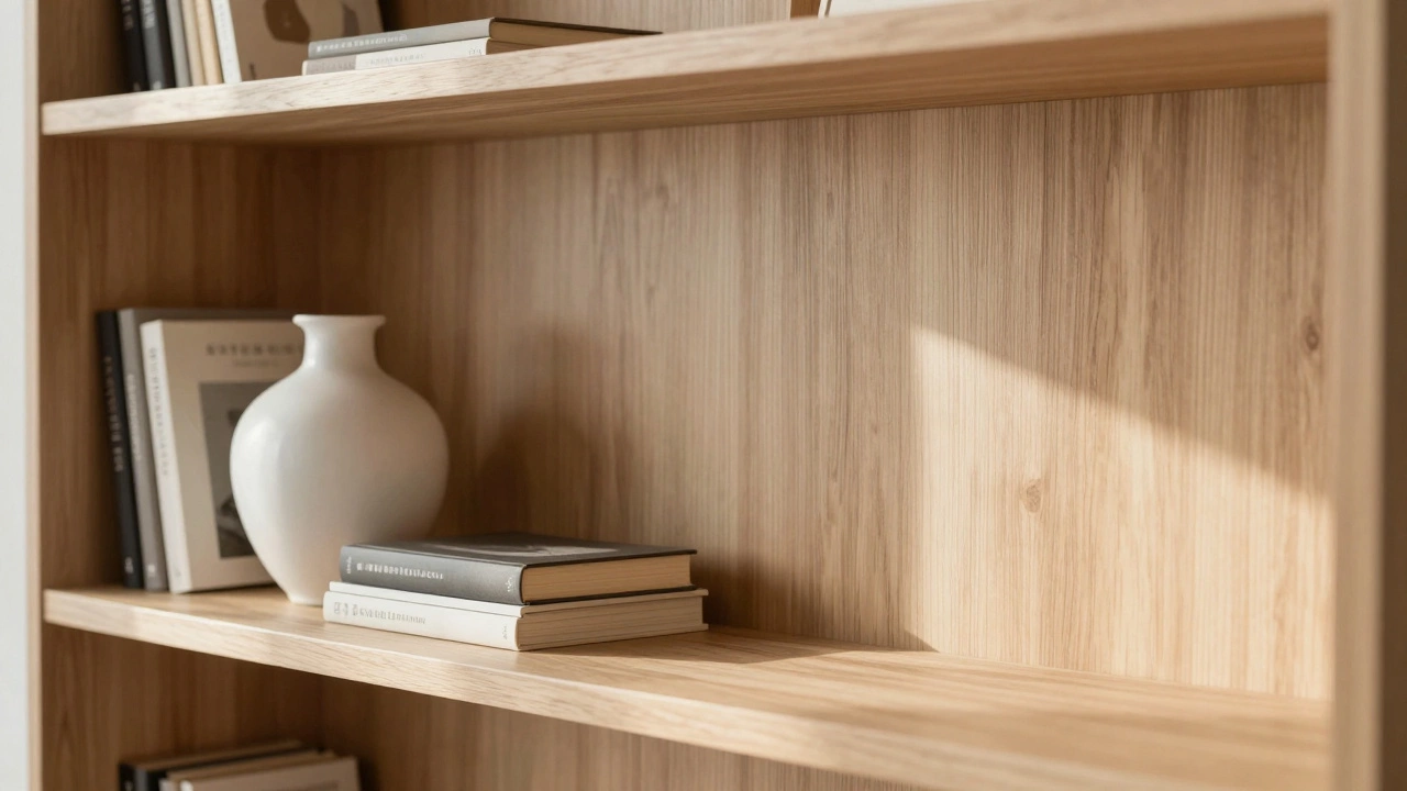
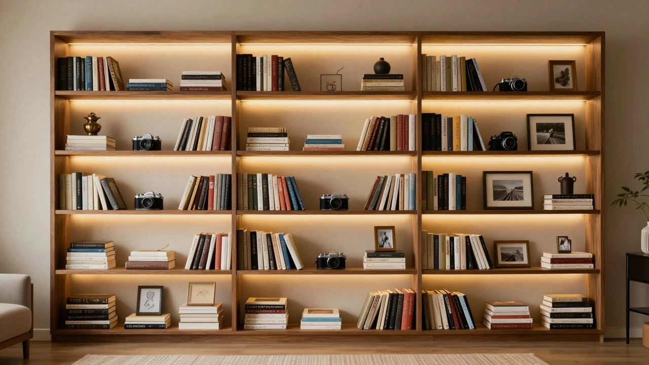
Think of empty space as part of the design. If you have a large vase, leave an open spot next to it. Let the wood grain of the shelf show through. This technique, often called "white space" in graphic design, works exactly the same way in interior styling. It gives the objects on display room to breathe. Try leaving at least 30% of each shelf empty. It sounds like a lot, but it instantly makes the remaining items look more intentional and valuable.
Mix Vertical and Horizontal Lines
Stacking books horizontally creates blocks of color and texture, but doing it exclusively makes the shelf look like a brick wall. Standing books up vertically creates height and structure. The magic happens when you mix these two orientations.
A simple rule of thumb is the "triangle method." Place a tall object (like a standing stack of books or a plant) on one side, and balance it with a shorter, wider object (like a horizontal stack or a tray) on the other. This creates a diagonal line across the shelf that leads the viewer’s eye from left to right. Avoid placing all tall items on one side and all short items on the other; that looks unbalanced. Instead, vary the heights randomly but keep the visual weight distributed evenly.
| Strategy | Visual Effect | Best Used For |
|---|---|---|
| Vertical Stacking | Adds height and airiness | Tall bookcases, narrow shelves |
| Horizontal Layering | Creates stability and color blocks | Wide shelves, displaying coffee table books |
| Triangular Grouping | Guides the eye across the shelf | Balancing asymmetrical objects |
| Negative Space | Reduces visual clutter | Highlighting statement pieces |
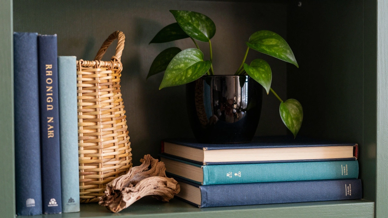
Introduce Texture and Material Contrast
If everything on your shelf is made of paper (books) and painted wood, the result will look flat. You need to introduce different materials to create depth. Think about the five senses. What does the shelf feel like? Is it smooth, rough, cold, or warm?
Add a woven basket for a natural, tactile element. Place a ceramic pot for a hard, glossy contrast against matte book covers. A piece of driftwood adds organic irregularity. Even a small mirror can reflect light and make the space feel larger. The key is contrast. Pair soft textures (like a throw blanket draped over the edge) with hard surfaces (like metal or glass). This variety keeps the viewer engaged because their brain processes different textures differently.
Use Color Intentionally
Color coding books by spine is a popular trend, but it can look sterile if overdone. Instead, use color to create accents. Pick a primary color palette for the room-say, navy blue and cream-and then use the book spines to echo those tones. Don’t try to match them perfectly. A deep teal book next to a navy one creates a subtle harmony without looking like a library archive.
You can also use color to break up monotony. If you have a lot of black-spined books, insert a bright yellow vase or a red picture frame in the middle. This "pop" of color draws attention to that specific section. Just limit yourself to one or two accent colors per shelf. Too many competing colors create chaos rather than interest.
Incorporate Personal Artifacts
A bookcase filled only with books looks like a bookstore. A bookcase filled with personal items looks like a home. This is where you inject personality. Travel souvenirs, vintage cameras, framed photos, or collections of rocks or coins add narrative value.
The trick here is curation, not dumping. Don’t put out every souvenir you’ve ever bought. Choose three or four meaningful items and give them space. Place a small sculpture on a pedestal (a stacked book works well) to elevate its importance. Rotate these items seasonally. Swap out summer beach shells for winter pinecones. This keeps the display fresh and allows you to showcase different parts of your life throughout the year.
Play with Lighting
Lighting changes everything. A dark corner with a dimly lit bookcase disappears into the background. Adding a small LED strip inside the shelf brackets or placing a small lamp on top of the unit highlights the contents and adds warmth.
If you can’t install built-in lighting, use directional lamps. Aim a floor lamp toward the upper shelves to cast dramatic shadows. Shadows add depth and mystery. They make the objects look more three-dimensional. Be careful not to use bulbs that are too bright, which can cause glare on glossy book covers or glass objects. Warm white light (around 2700K) is usually the most inviting for residential spaces.
Create Asymmetrical Balance
Symmetry is safe, but it can be boring. Perfectly mirrored arrangements feel static. Asymmetrical balance is more dynamic and interesting. This doesn’t mean random placement. It means balancing visual weight.
For example, a large, heavy-looking ceramic bowl on the left might be balanced by a cluster of three smaller, lighter objects on the right. The total "weight" of the composition feels equal, even though the shapes are different. This requires stepping back and looking at the shelf as a whole. Does one side feel heavier? Adjust by moving items closer to the center or adding a small object to the lighter side.
Common Mistakes to Avoid
- Overcrowding: Every item needs breathing room. If you can’t see the shelf surface between objects, remove some items.
- Ignoring Height Variation: Flat lines are dull. Mix tall and short objects to create vertical interest.
- Using Only One Material: Wood, paper, and plastic alone lack depth. Add metal, glass, fabric, or stone.
- Hiding Everything Behind Doors: If you have open shelving, use it. Closed cabinets are for clutter; open shelves are for display.
- Forgetting the Backdrop: Paint the inside of the bookcase a contrasting color. A dark green or navy interior makes white book spines pop dramatically.
Quick Styling Checklist
- Clean the shelves completely before starting.
- Select 5-7 anchor pieces (large books, plants, baskets).
- Arrange anchors first, ensuring varied heights.
- Add secondary items (small decor, photos) to fill gaps.
- Step back and check for visual balance (left vs. right).
- Remove any item that doesn’t serve a purpose or spark joy.
- Adjust lighting to highlight key pieces.
Should I organize my books by color?
Color organizing is visually striking but can make finding books difficult. If you choose this route, consider keeping a digital inventory or limiting it to decorative volumes. For frequently read books, prioritize genre or author. You can still incorporate color by grouping similar hues together rather than creating a perfect rainbow gradient.
How do I style a bookcase with few books?
Treat the bookcase as a display cabinet rather than a library. Use boxes or baskets to store less attractive items. Fill the remaining space with larger decor pieces like sculptures, plants, or framed art. Focus on quality over quantity. A few well-chosen objects look more sophisticated than many small, cluttered ones.
What is the best way to add plants to a bookshelf?
Choose plants that fit the light conditions of the shelf. Trailing plants like pothos or ivy work well on higher shelves, cascading down to soften hard lines. Succulents or small snake plants are great for lower shelves with less light. Ensure pots have saucers to protect the wood from water damage. Plants add life and movement to static displays.
Can I mix modern and vintage items on the same shelf?
Absolutely. Mixing eras creates visual interest and prevents the display from looking too themed or staged. Pair a sleek, modern geometric vase with an antique brass candlestick. The contrast in styles highlights the unique qualities of each piece. Just ensure there is a unifying element, such as similar colors or materials, to tie the look together.
How often should I rearrange my bookcase?
There is no strict rule, but seasonal changes (every 3-4 months) work well for most people. This allows you to swap out decor based on holidays or weather. If you notice the display feeling stale or cluttered, that is a sign to refresh it. Rotating items keeps the space feeling new and allows you to showcase different collections over time.