TL;DR
- The safe winner for most homes: warm whites and greiges on main walls; they feel bright, clean, and make rooms look bigger.
- Blue bathrooms and a black or deep navy front door still tend to appraise well with buyers based on multiple studies and listing data.
- Skip loud, saturated wall colors before selling; they shrink the buyer pool and can cut perceived value.
- Use eggshell for walls, satin/semi-gloss for trim/doors, flat for ceilings; test swatches in daylight and at night.
- Interior paint often returns 100%+ of its cost at resale (NAR), and curb appeal upgrades deliver quick wins.
You’re here for a simple answer: which color actually puts more money in your pocket when you sell? The short, honest take: light, warm neutrals throughout the main living spaces, a soft blue in bathrooms, and a crisp, dark front door color. That combo plays well across styles, markets, and listing photos. Still, the right shade depends on your light, floors, and finishes. I’ll give you the proven picks, then show you how to choose what works in your house-not just in a showroom.
The color that adds the most value (and where it matters most)
When buyers scroll through listings, they’re doing two things fast: judging brightness and estimating how much work they’ll have to do. Your paint choice should quietly say “move-in ready.” That’s why warm whites and greiges (a gray-beige mix) dominate the best resale results.
What the data says:
- Zillow’s paint color analyses over multiple years found that neutral, light interiors help homes sell faster and for more, with blue bathrooms and dark front doors consistently testing well with buyers (2017-2023).
- The National Association of Realtors’ Remodeling Impact Report has repeatedly shown interior painting yields one of the best cost recoveries-often around or above 100% of cost.
- Buyer preference surveys from large platforms (e.g., Opendoor, Realtor.com) keep pointing to “clean, neutral, bright” as the most appealing look online and in person.
The punchline: If you want one color family that raises perceived value, go with warm whites/greiges on the main walls. Then add a bathroom-blue and a dark, crisp front door if you want extra lift.
Best interior bets in plain English:
- Main living spaces (living, dining, halls): Warm white or light greige. Think soft, creamy without tipping yellow, or light gray with a warm undertone. These colors reflect light, photograph well, and don’t fight with flooring or tile.
- Bedrooms: Still neutral, but you can go slightly deeper greige or a calming pale gray with warmth. The goal is restful and clean. Avoid edgy accent walls unless your whole home skews modern and you’re nailing the execution.
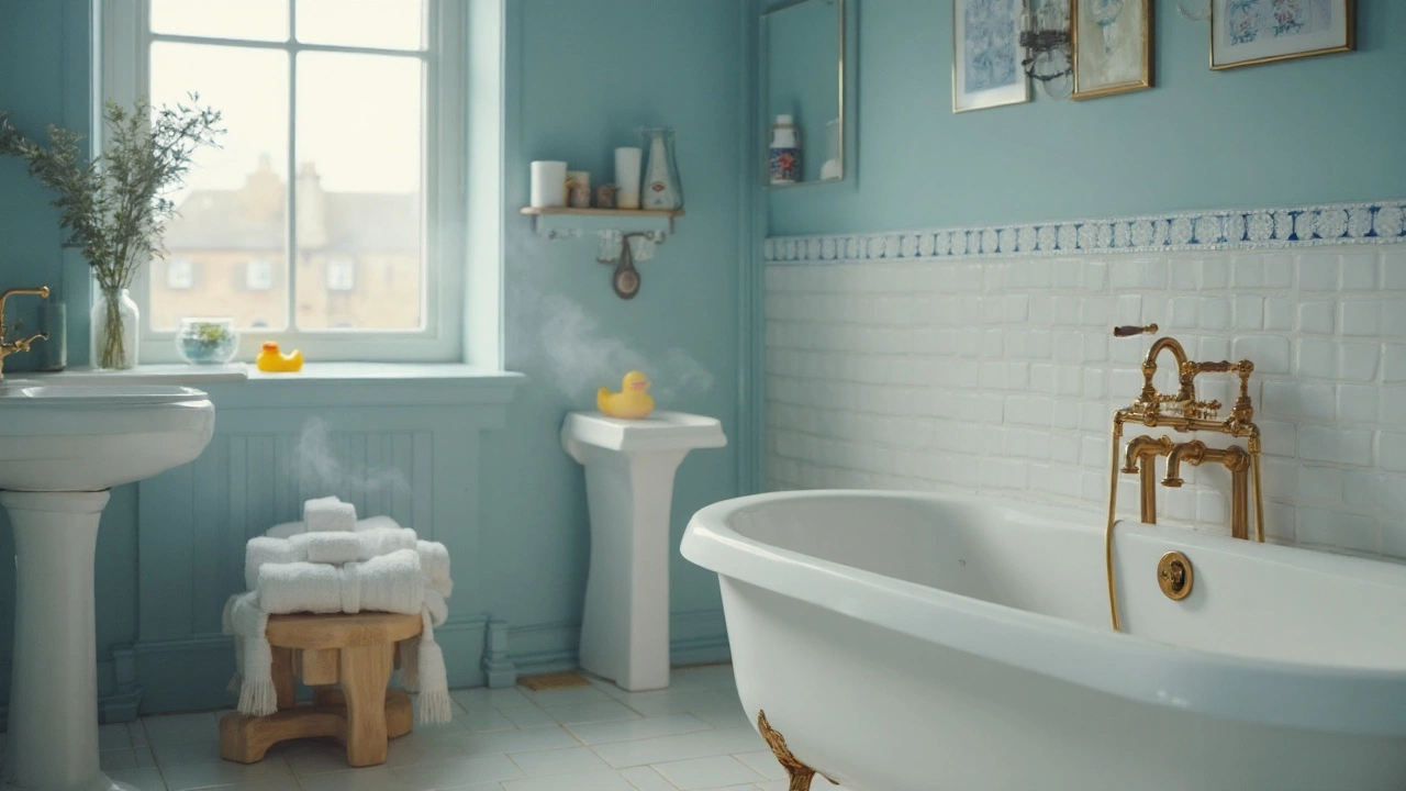
- Bathrooms: Soft, airy blues tend to score with buyers. This has popped up for years in resale data-blue reads fresh and spa-like next to white tile and chrome. Keep it light. Powder rooms can handle a touch more color, but don’t go too dark if the room is tiny.
- Kitchens: Stay light and neutral. If your cabinets are white, consider a whisper-soft warm white on walls for a crisp, seamless look. If your cabinets are wood, a light greige can balance warmth.
- Trim/doors: Bright white trim makes any wall color look cleaner and more expensive. Semi-gloss or satin for durability and crisp lines.
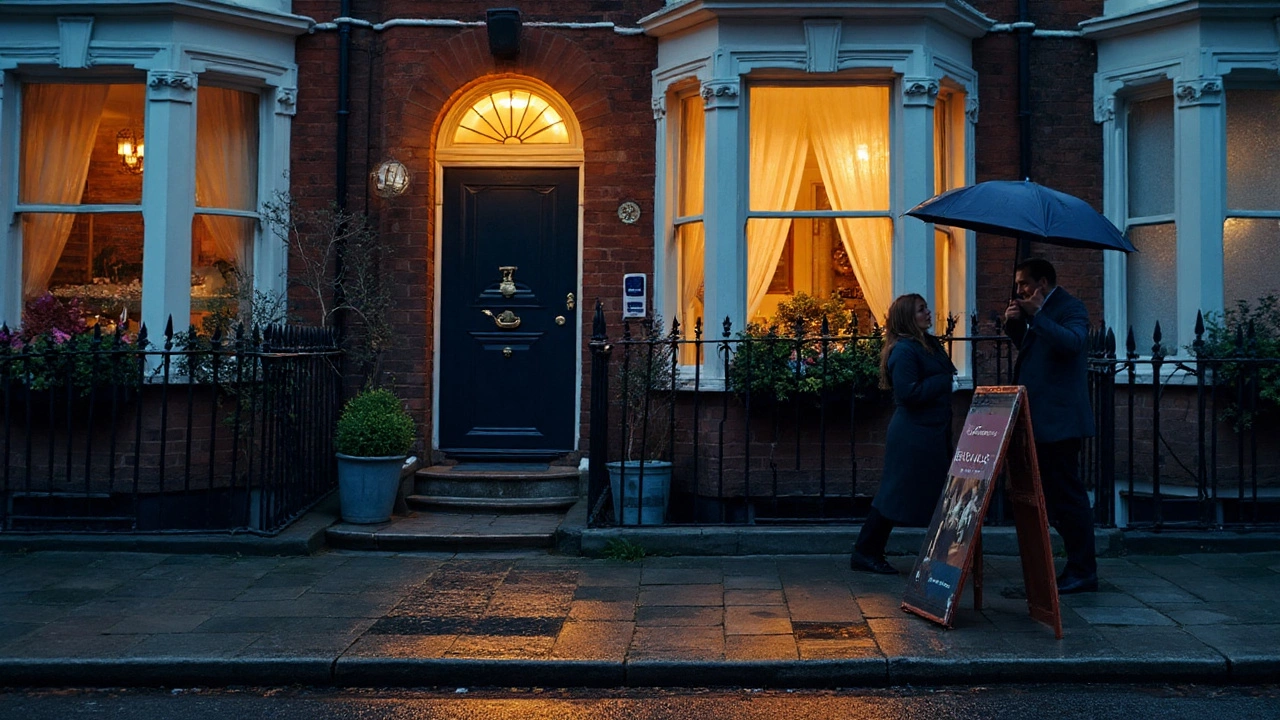
Front door (big bang-for-buck): A black or charcoal front door still tests strongly in buyer studies, with some Zillow analyses suggesting a noticeable bump in perceived value. Deep navy also lands well and looks high-end with brass or matte black hardware. Match the vibe to your exterior: traditional brick loves black; coastal siding loves navy.
Why these colors work:
- They flatter different flooring, from oak to LVP to tile.
- They read bright in listing photos, which helps you win online.
- They suggest “low maintenance” and “easy to furnish,” lowering buyer friction.
What to avoid if you want top dollar:
- Strong reds, oranges, bright yellows, or intense purples on big walls. They date fast and photograph harsh.
- High-gloss on walls. Shiny walls show every flaw and look odd in person.
- Five different colors in five adjoining rooms. It feels choppy and “project-heavy.”
How to pick the right shade for your house (light, finishes, and testing)
Even the right color family can look wrong if the undertone clashes with your floors or your light is tricky. Here’s a clean, step-by-step way to get it right the first time.
Step 1: Read your light the fast way
- North-facing rooms: Cooler light. Warm them up with a warm white/greige. Aim Light Reflectance Value (LRV) 60-80.
- South-facing rooms: Plenty of light. You can use a slightly cooler neutral or stick with balanced warm whites. LRV 50-70 is safe.
- East-facing (morning): Can look cooler by afternoon. Lean warm neutral.
- West-facing (evening): Can go orangey late day. Choose a balanced neutral that doesn’t swing yellow.
Quick LRV rule-of-thumb:
- Small or dark room? Target LRV 65-80 (brighter).
- Average room? LRV 55-65.
- Very bright room? LRV 45-60 to avoid a washed-out look.
Step 2: Map undertones to your fixed finishes
- Floors with orange/red tones (cherry, some oaks): Use a neutral with a slight green/greige undertone to cancel the orange.
- Cool gray tile/countertops: Use a warm greige or creamy white so the space doesn’t feel cold.
- Beige/tan tile (builder-grade): Greige bridges gray and beige, so it modernizes without clashing.
Step 3: Sample like a pro (15-minute process)
- Buy 2-3 sample quarts (or large stick-on swatches) in the same family: for example, warm white A, warm white B, light greige C.
- Paint 24”×24” squares on each key wall-or use peel-and-stick samples. Label them.
- Look at them at 8am, 1pm, and 8pm. Turn on the lights at night. One will stay calm across the day; the loser will go peachy, green, or dingy.
Step 4: Lock sheens that look expensive
- Walls: Eggshell (soft glow, hides minor flaws). Matte works too if walls are very smooth and you want zero sheen.
- Trim/doors: Satin or semi-gloss for durability and contrast.
- Ceilings: Flat. Paint ceilings a true ceiling white unless you need to lower visual height (then consider 10-20% darker than walls).
Step 5: Create a simple palette (60-30-10 rule)
- 60% main wall color (warm white/greige).
- 30% secondary neutral (slightly deeper greige for bedrooms or an accent in dining).
- 10% accent (textiles/art, not necessarily paint). If you must paint an accent, keep it subtle.
Reliable, buyer-friendly examples to test
- Warm whites to sample: look for soft, creamy whites with low yellow. Popular families include “white dove / alabaster / cameo / blank canvas” types.
- Greiges to sample: balanced, not too cool. Think “classic gray / balboa mist / agreeable gray” families.
- Soft bathroom blues to sample: powdery, slightly grayed blues that stay calm under warm light.
Regional twist you shouldn’t skip:
- Cool, cloudy climates (PNW, Northeast): Lean warmer so rooms don’t feel flat or cold.
- Very sunny climates (AZ, FL): Balance with neutrals that don’t blow out in photos; avoid stark, icy whites that can glare.
Cabinet and trim realities:
- If your cabinets are dated but staying, match the wall color to flatter them. Orange oak? Choose a greige with a whisper of green.
- If your trim is cream, not bright white, go with a warm wall color so the trim doesn’t look dirty.
On trends (2025): Big paint brands have been pushing warm whites and nature-based hues for a few seasons. Soft blues and grounded, not-too-gray greiges are still buyer catnip. Save moody greens and terracottas for accents or a powder room if you’re selling soon.
Execution that pays off: quick wins, costs, checklists, and a simple decision tree
Paint can be your highest-ROI prep. Here’s how to make it pay.
Fastest value moves (weekend plan):
- Front door: Black, charcoal, or deep navy in a durable exterior satin or semi-gloss. Replace door hardware if pitted; modern handleset can change the whole read.
- Main living area walls: One continuous warm white/greige shade to visually enlarge the space.
- Trim refresh: Bright white trim + caulked gaps = instant “new build” feeling.
- Bathroom walls: Soft blue or a very light neutral if your tile is already blue/green.
Budget and ROI snapshot:
- Interior paint (pro): Often $3-$6 per sq ft walls-only; $2-$4 DIY in materials depending on brand and coat count.
- Front door (DIY): $40-$90 in paint/supplies; pro labor can be $150-$300+ depending on prep.
- Interior painting cost recovery: Frequently near or above 100% according to NAR’s Remodeling Impact reports, with higher perceived value in photos and showings.
Decision tree (choose your path):
- Are your floors warm (orange/red) or cool (gray)?
• Warm floors → choose a balanced greige or a warm white with low yellow.
• Cool gray floors → a warmer neutral to avoid a cold, sterile feel. - Is your home dark or bright?
• Dark → pick higher LRV (65-80).
• Bright → use mid LRV (50-65) to avoid glare. - Do you have visible wall flaws?
• Yes → matte/eggshell walls; avoid higher sheen.
• No → eggshell is fine. - Selling in 30-60 days?
• Yes → keep the whole house to 1-2 wall colors + white trim. Paint front door dark. Bathrooms soft blue or neutral.
• No → if you’ll live there, you can personalize secondary spaces slightly.
Color-by-room cheat sheet:
- Living/dining/halls: Warm white or greige, continuous.
- Kitchen: Same as living for cohesion; if cabinets are white, use a whisper-warm wall.
- Primary bedroom: Slightly deeper greige if you want a cozy feel.
- Bathrooms: Soft blue or light neutral; avoid green undertones if tile is pink or tan.
- Ceilings: Flat white. If ceilings are low and you want height, paint them the same color as walls at 50% strength.
What not to do (costly mistakes):
- Don’t pick a bright white with heavy blue undertones-your space will feel cold and every scuff will show.
- Don’t chase trends with whole-house bold color. Buyers may love it online and hate it in person.
- Don’t mix five sheens. Keep walls one sheen, trim one sheen, ceilings flat.
- Don’t skip prep. Caulk gaps, spackle holes, sand sheen on glossy spots. Prep sells the finish.
Useful, real-world color impact ranges
| Area | Color approach | Why it works | Typical impact noted in studies/market |
|---|---|---|---|
| Main living areas | Warm white / light greige | Bright, move-in ready, matches most floors | Often helps homes sell faster; supports higher perceived price (Zillow multi-year analyses) |
| Bathrooms | Soft, airy blue | Reads clean/spa-like vs. tile/fixtures | Historically associated with price premiums in Zillow studies (magnitude varies by market/year) |
| Front door | Black/charcoal or deep navy | High-contrast, high-end curb appeal | Repeatedly linked to added perceived value in buyer testing (Zillow) |
| Bedrooms | Light greige / warm neutral | Calm, easy to furnish | Supports buyer appeal; avoids deductions from bold tones |
| Kitchens | Neutral walls | Lets cabinets/counters lead, keeps room bright | Neutral schemes track with faster, smoother sales |
Note: Dollar figures vary by area and year. Treat these as directionally strong, not guarantees. Always test in your light.
Real names of shades buyers like (use as starting points, then test):
- Warm white families: think along the lines of White Dove, Alabaster, Swiss Coffee, Cameo/Blank Canvas styles.
- Greige families: Classic Gray, Balboa Mist, Agreeable Gray, Revere Pewter-adjacent tones.
- Soft bathroom blues: Powdery, slightly grayed. Avoid overly bright “nursery” blues.
Application tips that make paint look expensive:
- Roll top-to-bottom in straight lines. Keep a wet edge to avoid lap marks.
- Cut-in with a good angled brush; tape only when needed, but burnish tape edges if you do.
- Two coats covers better than one “heavy” coat. Don’t rush dry times.
Supply list (lean and effective):
- Quality eggshell wall paint, ceiling flat, trim semi-gloss.
- Angled 2” brush, 3/8”-1/2” roller covers, roller frame, extension pole.
- Caulk (paintable), spackle, sanding block, drop cloths, painter’s tape (selectively).
Common combinations that always look good:
- Warm white walls + bright white trim + black front door + brass or matte black hardware.
- Greige walls + white trim + navy front door + natural wood accents.
Mini-FAQ
- What single color adds the most value?
For most homes and markets, a warm white or light greige across the main areas increases perceived value the most because it appeals to the widest group and makes spaces feel larger. - Do blue bathrooms still help?
Yes, soft blues continue to scan “clean and spa-like” and have tested well in Zillow’s analyses for years. Keep it light and slightly grayed. - Is gray out?
The cold, blue-leaning grays of the mid-2010s feel dated now. Greige (warm gray) still sells because it bridges wood tones and modern finishes. - Should trim always be white?
For resale, bright white trim is the easiest win. If your trim is cream and you aren’t repainting it, choose a warmer wall so the trim doesn’t look dirty. - How many wall colors inside?
One or two, tops, for a clean, cohesive look. Add color with textiles and art. - Matte or eggshell on walls?
Eggshell is forgiving and cleans better. Matte hides flaws but can scuff more; use if walls are very smooth. - Will an accent wall help?
Usually not. If you must, keep it subtle and aligned with the home’s style.
Next steps by scenario
- Selling in 2 weeks: Paint the front door black/charcoal, touch up trim and baseboards, patch the worst wall, deep-clean. Don’t start a whole-house repaint unless you have a crew.
- Selling in 30-60 days: Repaint the main areas in a warm white/greige, refresh trim in bright white, switch bathrooms to a soft blue or light neutral, and do the front door.
- Staying 1-2 years but planning to sell: Live with warm neutrals now so you don’t repaint twice. Personalize with rugs, art, and throw pillows.
- Dark home with small windows: Choose a higher LRV warm white, add brighter LED bulbs (2700-3000K), and use white drapery to bounce light.
- Gray floors you can’t change: Choose a warm greige or creamy white to avoid a cold look; repeat warm wood or brass accents.
- Heavy orange oak everywhere: Pick a greige with a slight green undertone to balance the orange. Avoid yellow-leaning creams.
Final take you can bank on: If you want simple, proven paint colors that add value, run with warm whites or greiges in the main spaces, soft blue in baths, and a black or deep navy front door. Prep well, use the right sheen, and keep the palette tight. You’ll attract more buyers and make your photos pop-which is half the battle in 2025.